Navigate to:

Brand Development & Logo redesign for a project management agency
Sarah Hayes, a construction project manager in the Ithaca, NY region reached out to us for a comprehensive rebrand and website design & build. Her previous brand featured a bright green palette and puzzle piece logo design, which was undeveloped and unsophisticated—it didn’t elevate her brand. That’s where True Creative came in.
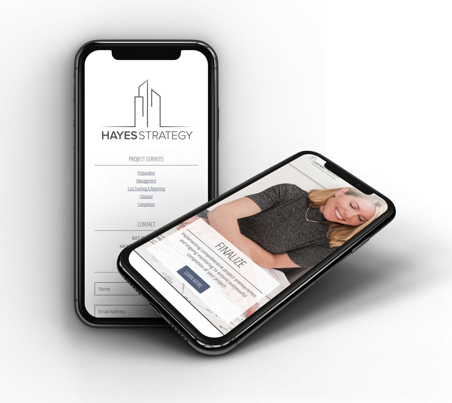
Our first priority was to educate ourselves on everything Hayes Strategy provides, and the processes used to manage and deliver their services. We used this information to conceptualize a clean, sophisticated, and minimalistic logo design using a neutral grey color palette and modern typography. We used simple, clean lines to illustrate and allude to the construction & building focus of her services and projects.
Portrait Photography and Action Photography for use throughout marketing initiatives
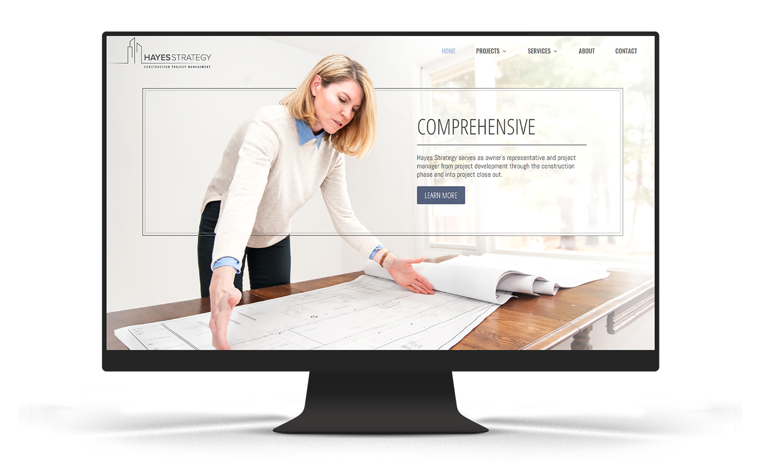
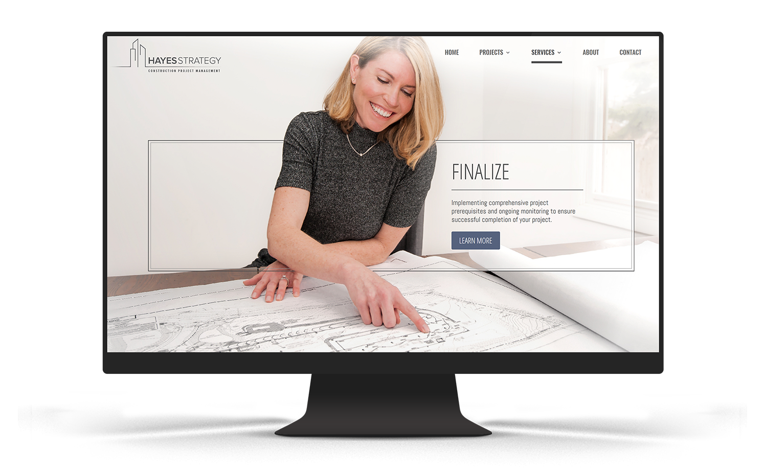
With the logo design and brand exploration process complete, we began to delve into the website design. Imagery is key to every successful website design—the online use of imagery communicates information to the visitor much quicker than reading text and other information. In the case of Hayes Strategy, we determined that it was critical for the website to use authentic imagery of Sara Hayes, owner of Hayes Strategy, in action rather than using stock imagery to metaphorically represent her services.
True Creative staged and shot a collection of portrait photos and action shots of Sara Hayes presenting information to clients and reviewing information with colleagues. We also staged and photographed a setting for formal portrait shots to be taken. Once edited, a final collection of images were delivered.


A website design that brings everything together into a cohesive marketing platform
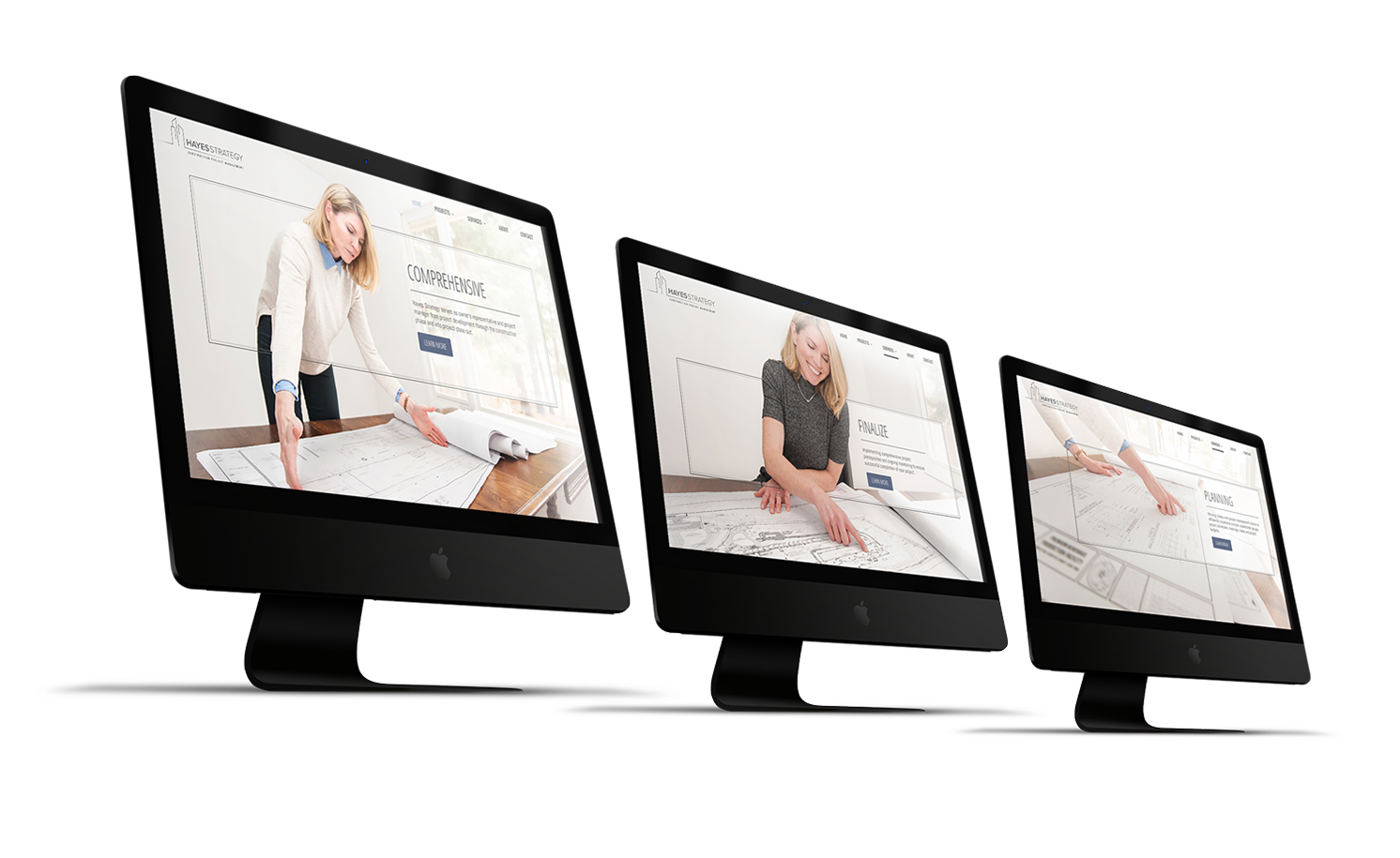
Once the logo, brand platform, and photography were completed, we incorporated all elements into the new website design. Each of the final images taken during the photoshoots were utilized as opening web page compositions. The website design uses a minimalistic design approach to reinforce the quality and style of minimalism used in the logo design. We applied accents of neutral grey and blue to large, open areas of white to maintain a sophisticated atmosphere. Each opening image composition includes thin grey lines woven through the elements in the image to create an immersive depth and seamless incorporation of image, color, line, and text at the opening of every page.
Overall, the website design is simple but powerful. It’s the perfect example of how a few small but strategic design elements can make a huge difference.


