Navigate to:
Logo design & brand development to discover the focus of their brand
When our engagement with Focus Forward began, they were operating under the company name “Fit, Fulfilled, and Free”. While this accurately represented the services they offer, it wasn’t an appropriate company name—more of a tagline that described their services rather than represented their brand. Our first step was to conceptualize a new company name using keywords and notes gathered during preliminary meeting discussions. Ultimately, we arrived at Focus Forward.
Focus Forward does more than health and wellness coaching—they provide comprehensive lifestyle re-orientation services by discovering the core issues holding you back from making meaningful and positive progress in your life. These issues may be financial, emotional, social, occupational, domestic, or health-related. Focus Forward focuses in on these issues and provides lifestyle coaching to inspire positive progress moving forward. This is the core of their brand, and ultimately the new company name we arrived at. The former company name, “Fit, Fulfilled, and Free,” was restructured into a 3-keyword brand signature line “Insight. Discovery. Fulfillment.” to better describe the process and outcome clients can expect from their services.
When redesigning their logo to fit and magnify this new brand platform, a full spectrum of symbols and colors were explored. There are three main elements that define the symbolism and success of the new logo: the warm & energetic color palette, the artistic painterly texture, and the use of a circular shape formed by the paint strokes, creating a sense of movement and momentum. These elements come together to symbolize the positivity and sense of vitality individuals feel from Focus Forward’s services.


Website design to reflect and magnify the new brand elements
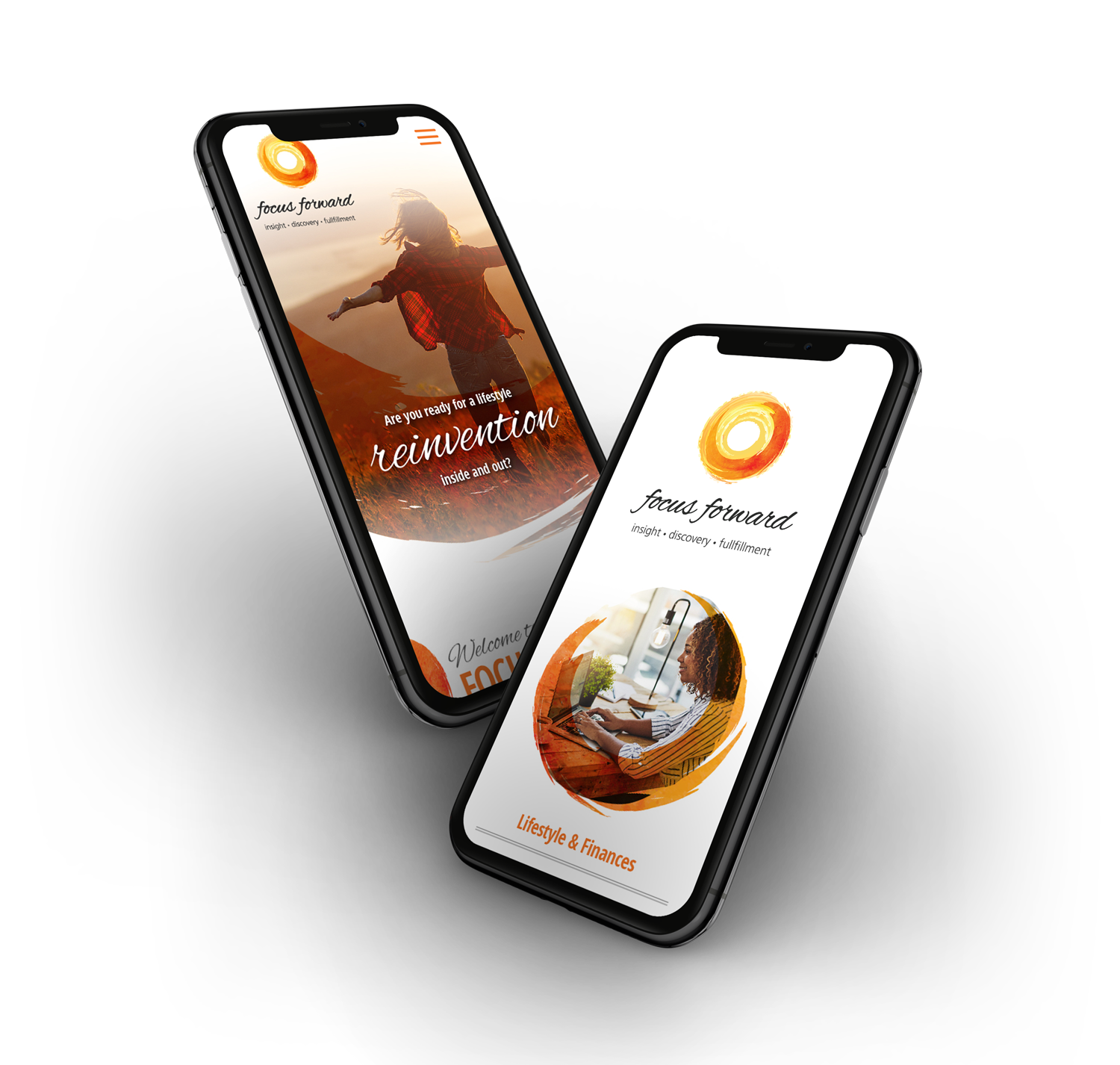
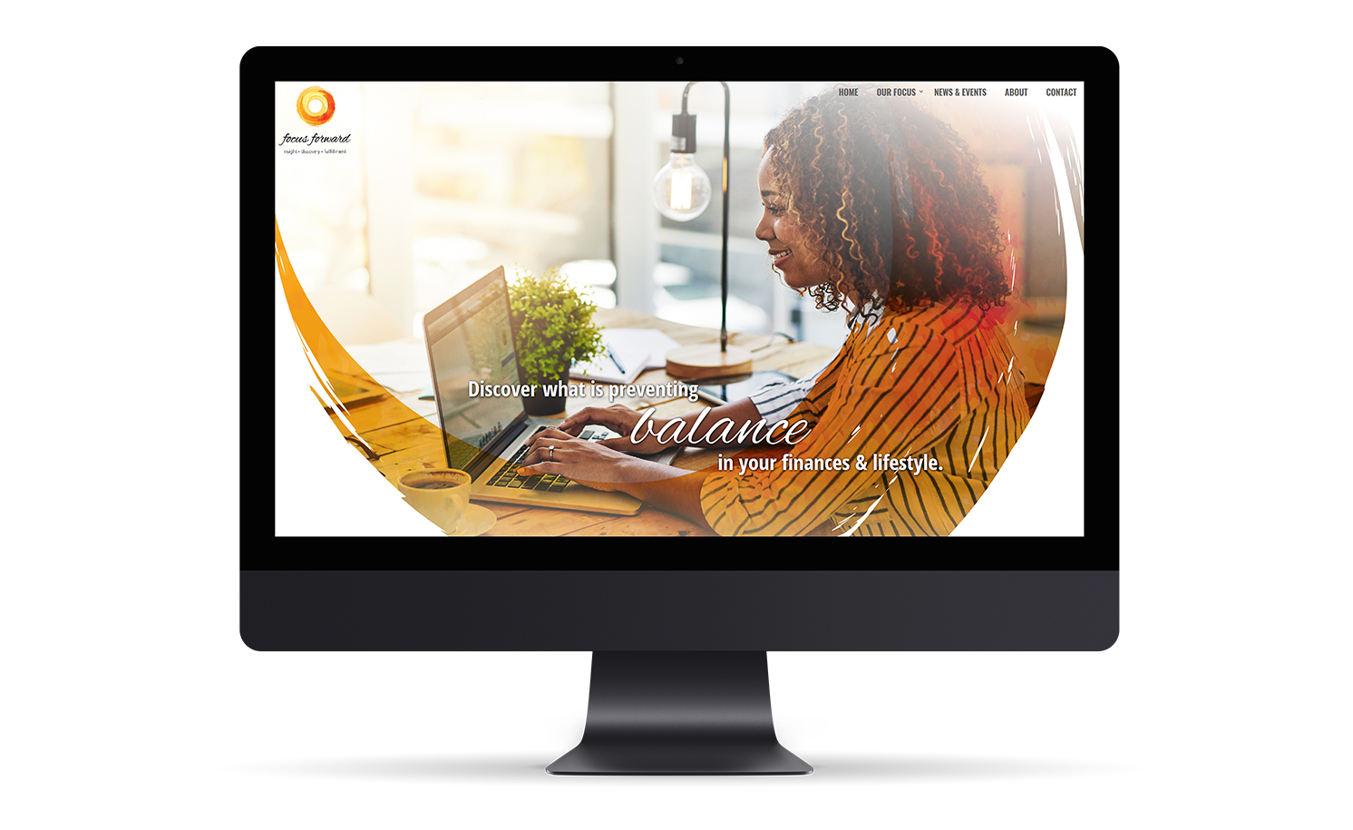
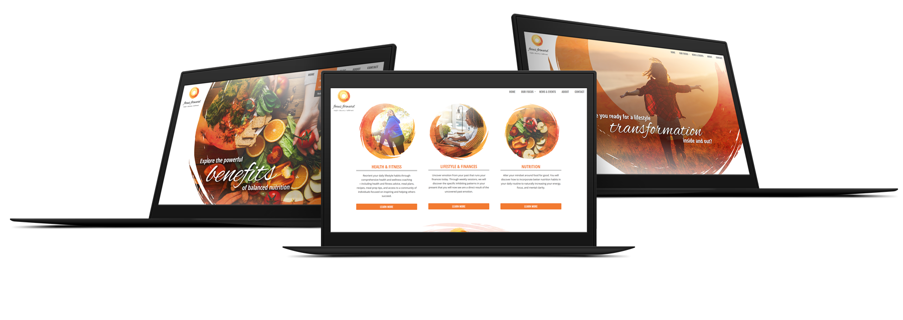
With the new brand platform and logo design complete, True Creative explored a new website design to reinforce the new brand elements. We used a blend of texture & color from the logo design with authentic & sophisticated imagery to create a design that magnified the new brand for Focus Forward. The warm & energetic color palette, the artistic painterly texture, and the use of a circular shapes formed by the paint strokes from the logo design were used in the new website design to create captivating opening image compositions and stylized section breaks on each page. The overall energy communicated when arriving at the new Focus Forward website design is a sense of wellbeing, joy, warmth, energy, and vitality. It’s refreshing, exciting, and engaging—characteristics that define who and what Focus Forward is.


